Design Principles Repetition and Contrast Seen in Nature and Interior Design
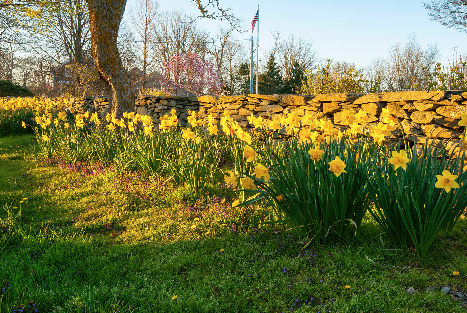
Lost deep in thought, enjoying an early morning drive down a quite country road while the sun peaked over the horizon, I was instantly struck by the beauty of springtime. My attention shifted quickly from the thoughts deep within my mind to the gorgeous sea of yellow that ran along the side of the road. Drawn in by the beauty, I was compelled to admire the brilliance of the showy yellow, trumpet-shaped petals against the dark, rough, imperfect looking backdrop. An abundant amount of free flowing daffodils were blooming so elegantly abreast a rustic stonewall that lined the street for what seemed to go on for miles. This vision was so stunning; the beauty of the scenery lingered with me for hours. Reflecting on this roadside scene, I realized the reason for its lasting impression was due in part to the deliberate use of two key design principles used by the landscape architect.
The first design principle apparent in the mass planting of yellow daffodils echoed along the road was repetition. Repetition is a technique that uses the same or similar elements more than once throughout a design plan, such as color, shape, texture or pattern, to create a sense of unity and rhythm. This design principle creates a reaction that causes a visual image that is extremely thought provoking. It is a conscious, preplanned design decision used by the designer to make a powerful, lasting statement.
Another important design principle used by the landscape architect, celebrated in the stonewall backdrop, was contrast. Contrast is the juxtaposition of opposing elements used to create drama and interest. This fundamental design principle is often the key ingredient that elevates a composition transforming it from flat to fantastic. When arranging opposite elements such as light and dark, large and small, straight and curvy, rough and smooth, visual significance is created which highlights key elements of a design. These elements were witnessed in the rough tactile texture, curvy shapes, and earthen color of the vertical stonewall paired with the smooth, brightly colored, trumpet like petals of the daffodils, an exquisite example of opposing textures emphasizing the use of contrast.
Illustrated in the photos below are the principles of repetition and contrast applied in interior design. In Exhibit A, repetition is observed in the multi-hanging pendant lights, the natural greenery, and the use of the color orange. The design principle of contrast is seen by pairing the opposing shapes of the free flowing curvaceous settee with the straight lines of the pendant lights, rectangular blocks of color on the walls and floor and the horizontal window blinds. By utilizing these two design principles the interior designer of this modern interior was able to generate a powerful long lasting effect.
Exhibit A
In Exhibit B repetition is noted by the multiple ways the designer uses the color black. Black is recognized in the hanging light fixture, picture frames and dining chairs creating a sense of harmony and movement in the space. Visual drama is enhanced by the juxtaposition of the round table and organic chairs paired with the linear wainscoting and herringbone pattern plank flooring. This is a wonderful example of where the use of design principles repetition and contrast were instrumental in establishing an aesthetically pleasing interior.
Exhibit B
Design elements and principles have been used throughout history. They are the building blocks utilized to organize, plan, and create a solid composition. We can only speculate as to their origination, however I believe they were inspired by nature. Perhaps a topic we will explore in a future article along with additional design elements and principles. For now, have fun experimenting with the principles of repetition and contrast while creating your next “art” creation.


